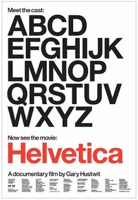
I recently watched the documentary, “Helvetica,” about the rise, and fall, and rise again of the popular typeface.
As a graphic designer, I remember the impact the Swiss typeface had on our thinking. It is so clean, so beautiful, so hard to wreck it through improper use. I enjoyed listening to the designers and typographers talk about their work and points of view. One man said that in the “early days,” graphic designers, as well as every other kind of designer, thought of themselves almost as healers, healing the visual clutter and “illness” of society’s communication blight.
I remember thinking this too, as I was captivated by good design. We would improve society through clarity and elegant usefulness, by creating healing environments, objects that would delight us while we used them, and logos and graphics that would focus our minds into harmony instead of chaos!
I found it fascinating how, because of its goodness, Helvetica became over-used and identified with establishment thinking, since it was so often employed for signage and government institutions—because it so eminently readable and neutral. It became ubiquitous. Designers rebelled and moved toward hand-drawn lettering, experimenting with organic shapes, a la Peter Max. They wanted type to look like what it was conveying, rather than to be a neutral carrier of meaning.
What was surprising, then, were the interviews with the young designers of today, who are rediscovering Helvetica and attempting to reinvent it by using it in intelligent new ways. Full circle from 1957.
There are some things that are classic, and they are classic because they are universally true, and simple, and represent beauty, clarity, and other universal, spiritual characteristics. We may rebel against a style, but what is beautiful will always re-emerge, will always communicate across cultures, will always be “real” in some greater way.
Here’s the trailer for the documentary: https://www.youtube.com/watch?v=wkoX0pEwSCw
